President Obama’s 2016 Budget in Pictures
Today we at the National Priorities Project released our annual President’s Budget in Pictures publication which breaks down President Obama’s fiscal year 2016 budget in a series of charts.
Budgets are about our nation’s priorities: What do we want to spend money on? How are we going to raise the money we want to spend? And though ultimately the budget enacted by Congress will probably look very different from the budget proposal released by the president, the president’s budget is important. It’s the president’s vision for the country in fiscal year 2016 and beyond and reflects input and spending requests from every federal agency.
Here are just two of the pictures we put together to explain the president’s budget:
Discretionary Spending
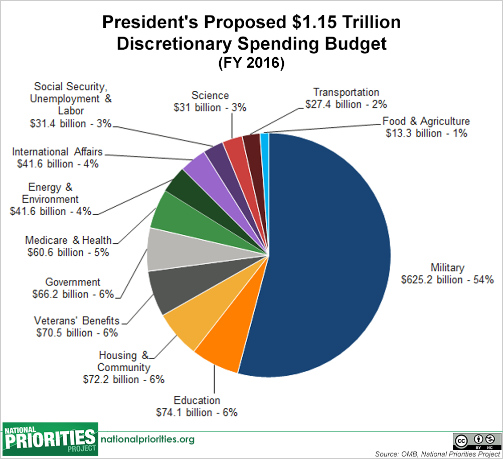
President Obama proposes to spend $1.15 trillion in discretionary spending in fiscal year 2016, an increase of 2 percent over 2015 spending levels. Discretionary spending is the portion of the federal budget that Congress determines annually in the appropriations process. Military spending of $625 billion would account for more than half of discretionary spending under the president’s proposal, leaving just 46 percent of the discretionary budget, or $530 billion, to spend on all non-military discretionary programs. That split is about the same as what Congress approved for this fiscal year, but the president’s proposal includes increases for both military and non-military spending. This chart shows how the president would break down discretionary spending:
Individual and Corporate Income Taxes as a Percent of Total Federal Revenue
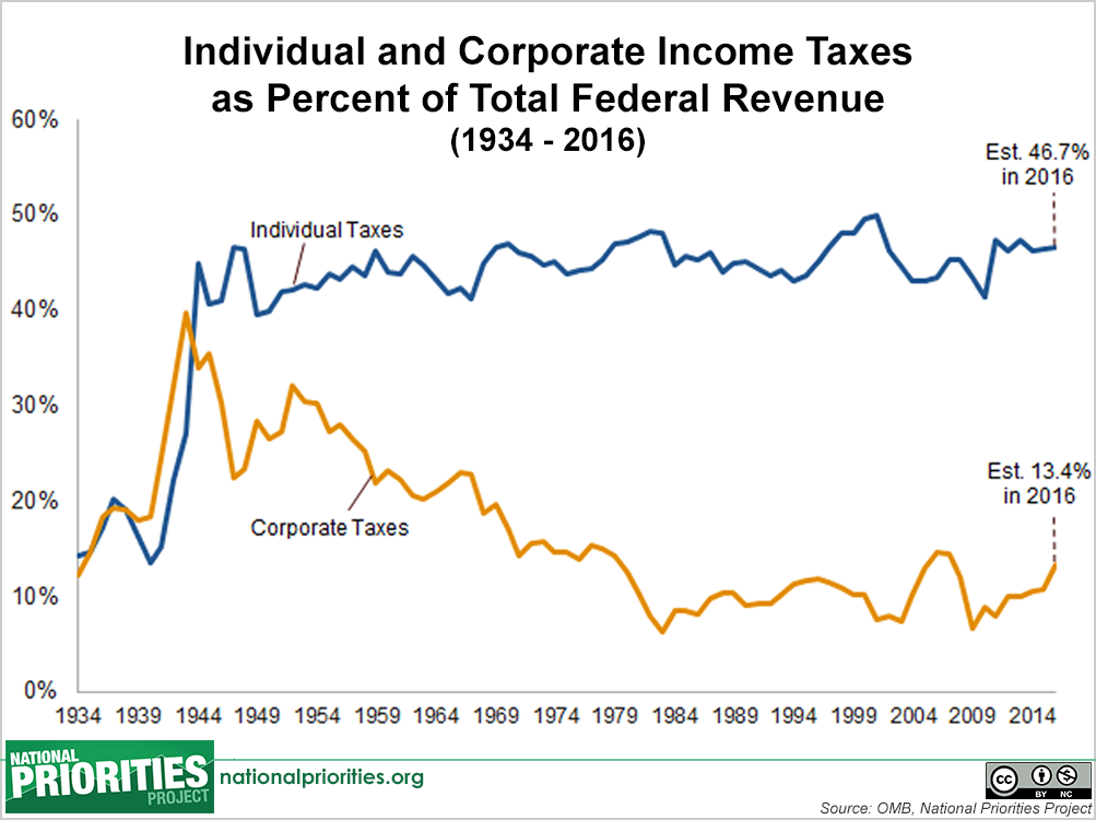
In fiscal year 2016, President Obama projects that total tax revenue under his proposed tax plan would be $3.5 trillion. Individual income taxes would account for 46.7 percent of total tax revenue, while corporations will contribute 13.4 percent. The president’s plan would bring in $320 billion in new tax revenue over ten years by closing loopholes related to capital gains taxes (taxes on income from investments, like stock or real estate), and by introducing new fees on big financial institutions that take big risks by borrowing excessive amounts of money.
The remaining 40 percent of federal revenue will come primarily from payroll taxes from Social Security and Medicare, as well as other sources such as customs and excise taxes. This chart shows how tax revenue from individual income taxes and corporate income taxes has changed over time.
Head on over to our President’s Budget in Pictures page to see more charts. To read more details about how the president proposes spending $4 trillion, check out our analysis.


The views and opinions expressed in this post are those of the author(s) and do not necessarily reflect those of MomsRising.org.
MomsRising.org strongly encourages our readers to post comments in response to blog posts. We value diversity of opinions and perspectives. Our goals for this space are to be educational, thought-provoking, and respectful. So we actively moderate comments and we reserve the right to edit or remove comments that undermine these goals. Thanks!